Secure Banking App Payment Verification Flow
A self-initiated brief created for a capstone project.
Balancing UX, security and regulatory constraints so users can confidently approve legitimate payments.
Link to Prototype:
https://www.figma.com/proto/sQ3Emnvy6qn0rhCQrFgnjw/Untitled?node-id=10-9&t=F2M0qruNIIl7qVlN-1&scaling=scale-down&content-scaling=fixed&page-id=0%3A1&starting-point-node-id=10%3A8
(Press R to restart prototype)
The Product
A conceptual, redesigned payment verification flow for a Singapore bank that allows users to authenticate and approve legitimate transactions in-app when flagged by security checks. The goal was to preserve safety and compliance without creating confusion, anxiety or a sense of being “blocked” by the bank.
This case shows how UX, security and compliance can coexist in a way that feels fair, transparent and balanced rather than a tradeoff.
Focus Areas
Research and Insights, Service UX, Interaction Design, UX Writing, Prototyping & Testing
Role
Sole UX/UI Designer (end-to-end product thinking, UX strategy, wireframing, UX writing, interaction design, prototyping)
Project Duration
3 weeks

The Context
When a payment is flagged as suspicious, the bank blocks the transfer to protect the user. These checks prevent scams and fraud, but they also interrupt legitimate payments. For many banking customers, this leads to a "robotic" experience of endless button-pressing and long phone waits just to reach a human.
While necessary for fraud prevention, the experience often feels like a penalty. Users wonder if their account is compromised, if there are issues with their card, if they made a mistake, or if the bank is being overly strict. They don’t understand why they’re being stopped, and the moment quickly becomes emotional: anxiety, uncertainty, and frustration collide exactly when reassurance is needed.
Banks however, have real responsibilities: fraud prevention, regulatory rules, and liability. These can’t be removed, and friction is often intentional. The challenge is that users only see the UX layer, not the policy or risk logic behind it.
The Rationale: Why Friction Exists
Before designing, I discovered that many pain points were risk and compliance choices rather than UX oversights.
Friction as Proof: MAS (Monetary Authority of Singapore) regulations require clear customer consent. Banks rely on phone calls because they provide a conservative audit trail and human judgment.
The "Human" Lock: Fraud systems often "lock" high-risk transactions until a staff member reviews or releases them. In certain scam patterns, banks intentionally want a human to advise or override a user’s decision.
This project asks:
What if we didn’t have to choose between safety and convenience?
My goal was to reimagine this moment so it remains compliant and secure, but feels smoother, more transparent, and more respectful of the user’s agency.
The Design Challenge
How might we replace time-consuming phone calls and let users confidently and quickly approve legitimate payments in-app without compromising regulatory requirements or trust?
Key Research Insights
I did a survey with 10 individuals (ages 30–65) to understand gaps between bank security and user trust.
Key findings:
The "Why" is Missing: 80% of respondents wanted an explicit "reason" for a block. Many only discovered a payment failed much later.
Trust in Tech: 80% preferred in-app verification, 70% found biometrics more secure and less effortful than SMS OTP.
Emotional Friction: 50% rated their experience in resolving blocked transactions as "frustrating," citing anxiety and a sense of being disempowered by outdated systems.
The Proposed Solution
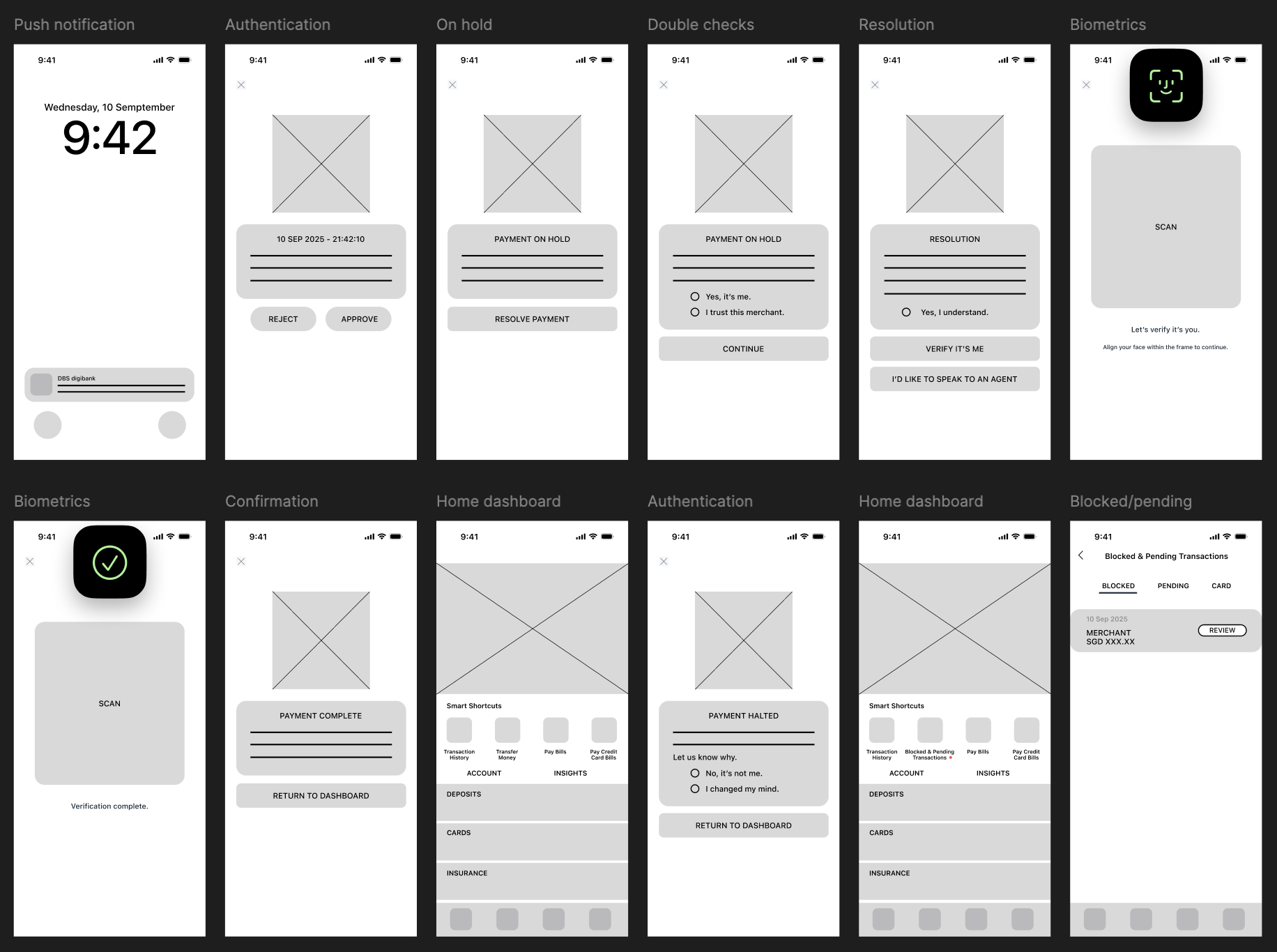
I leveraged the existing DBS/POSB design language but softened the "Security Moment." The strategy was to move from a "Hard Block" to an "Informed Confirmation."
Step 1 - Immediate Clarity: A push notification provides instant feedback. The app states the reason for the block clearly, avoiding alarming language.
Step 2 - The Audit Trail: The user confirms they understand the risks of the proposed resolution through checkboxes. This fulfills the bank’s need for a logged decision. The result is a clean, 3-tap flow.
Step 3 - Biometric Resolution: FaceID/TouchID completes the verification in under 90 seconds.
Step 4 - The Safety Net: If a user is uncertain, a secondary path to a 24-hour hotline is always available, making human support a choice.
Step 5 - Clear confirmation: Once verified, payment is completed normally.
Design Decisions
Visual Evolution: Mid-Fi to High-Fi
Mid-Fidelity: Defining the Core Logic
The design extends the existing DBS/POSB framework, introducing three critical elements: a biometric face-scanning interface, a "Blocked & Pending" management tab, and a back-end logic for logging user decisions to satisfy audit requirements.
High-Fidelity: Modernizing the Experience
The interface was evolved to feel softer and more modern. I removed heavy borders, introduced rounded corners, and utilized subtle shadows to create depth. Information Architecture (IA) was improved through typography—adjusting weight and spacing to ensure key transaction data is scannable at a glance, reducing cognitive load during high-stress moments.
Design Decisions
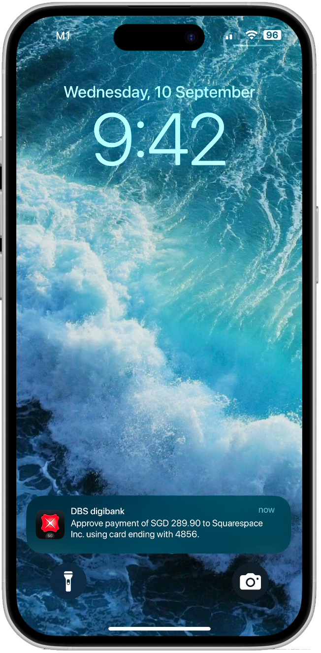
Trigger: A push notification provides instant feedback.
The Happy Path
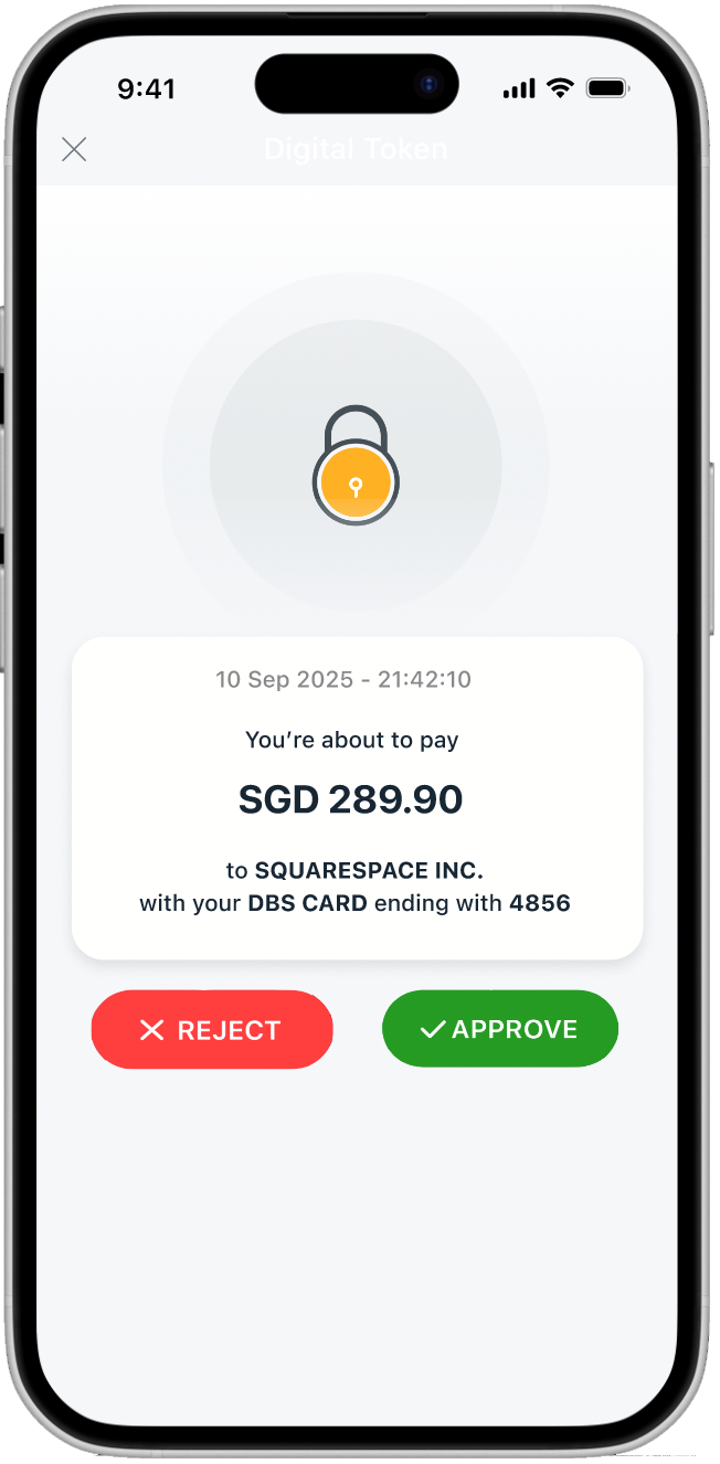
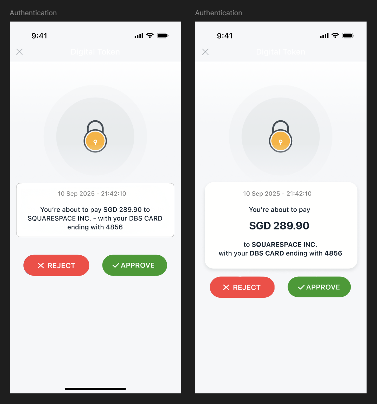
Transparency: Amount, payee, and card details are surfaced immediately so the user can verify the transaction’s legitimacy without digging through menus.
Call to action buttons use red and green to visually reinforce each decision: proceed or stop.
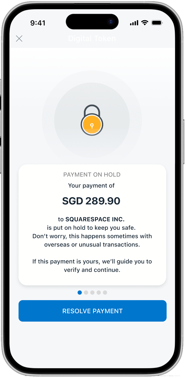
The "Why" Behind the Block: The block reason is stated in calm, non-alarmist language. I included progress indicators to set expectations, letting the user know exactly how many steps remain in the resolution flow.
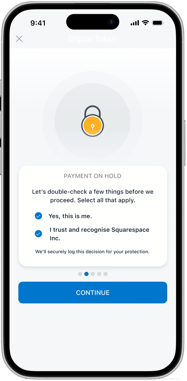
Active Verification: The app confirms both the user’s identity and their trust in the payee. Selection feedback (blue ticks and bolding) provides clear visual affordance that a choice has been made.
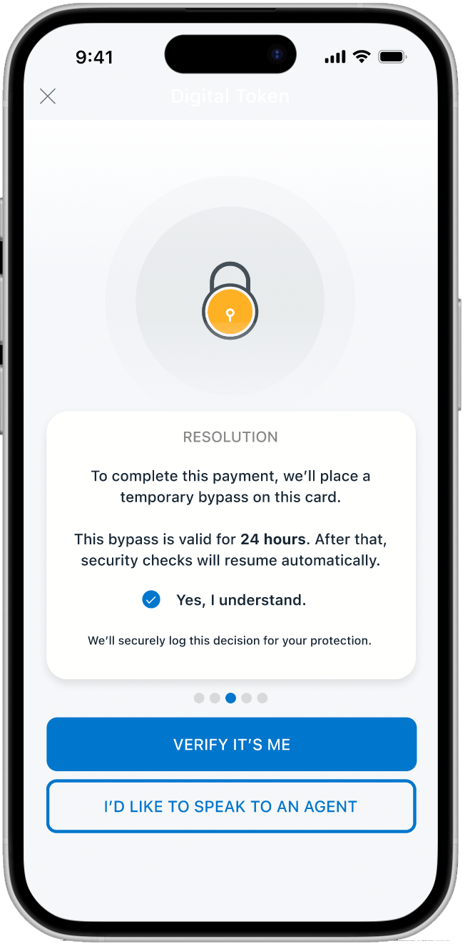
The Audit Trail (Compliance): Before proceeding, the app explicitly discloses that the decision will be recorded. This fulfills regulatory requirements while ensuring the user feels in control of the liability shift.
Strategic CTA Placement: The primary blue button nudges users toward the digital path, while a secondary "Speak to Agent" option remains as a safety net for edge cases.
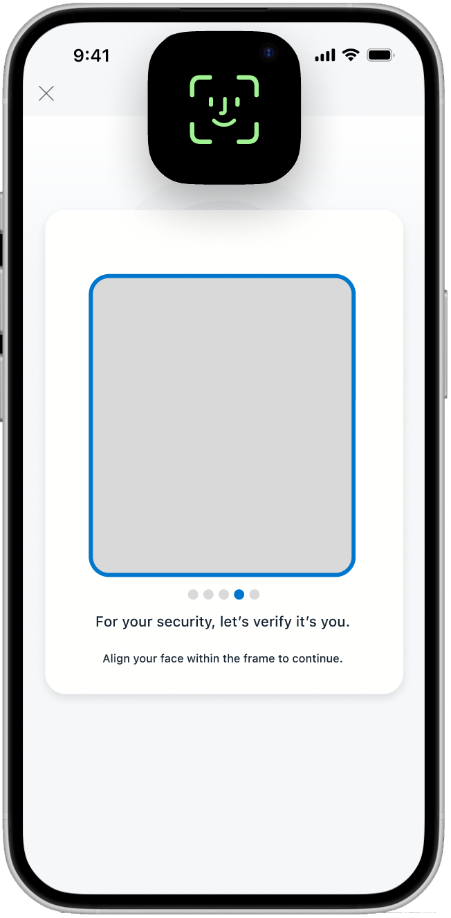
Biometric Integration: A clean, distraction-free face-scanning screen provides the "Strong Authentication" needed for high-risk transfers with zero manual friction.
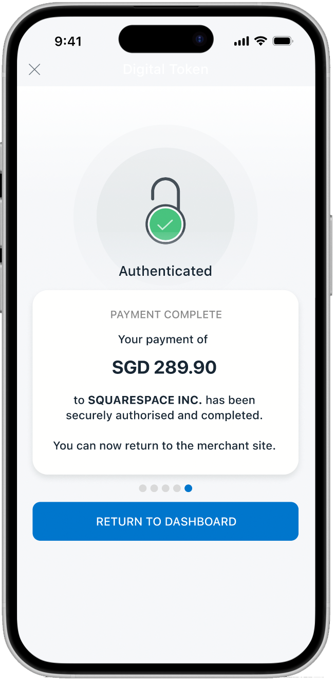
The Success State: A high-contrast green icon provides immediate emotional relief. The amount and payee are recapped one final time to provide closure and certainty.

Clean Dashboard State: Once resolved, users are routed to the dashboard for daily banking tasks.
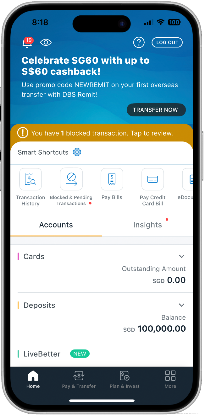
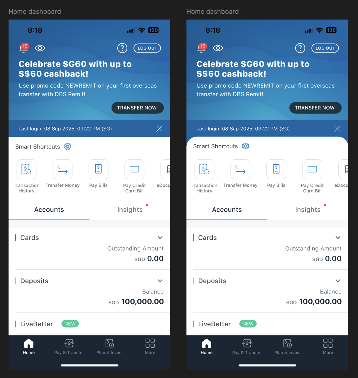
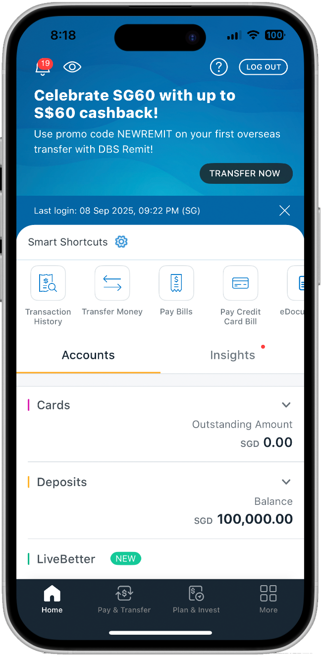
Multiple Entry Points: If a user exits, a new shortcut called “Blocked & Pending” appears with a red notification dot and a gold "Smart Shortcut" banner appears on the dashboard.
Persistence without Intrusion: A persistent banner ensures the issue isn't forgotten, creating a fail-safe path back to the verification flow. The gold palette was chosen to stand out against the DBS blue while remaining informative rather than alarming.
Alternate path
Scenario A: User Exits Mid-Flow
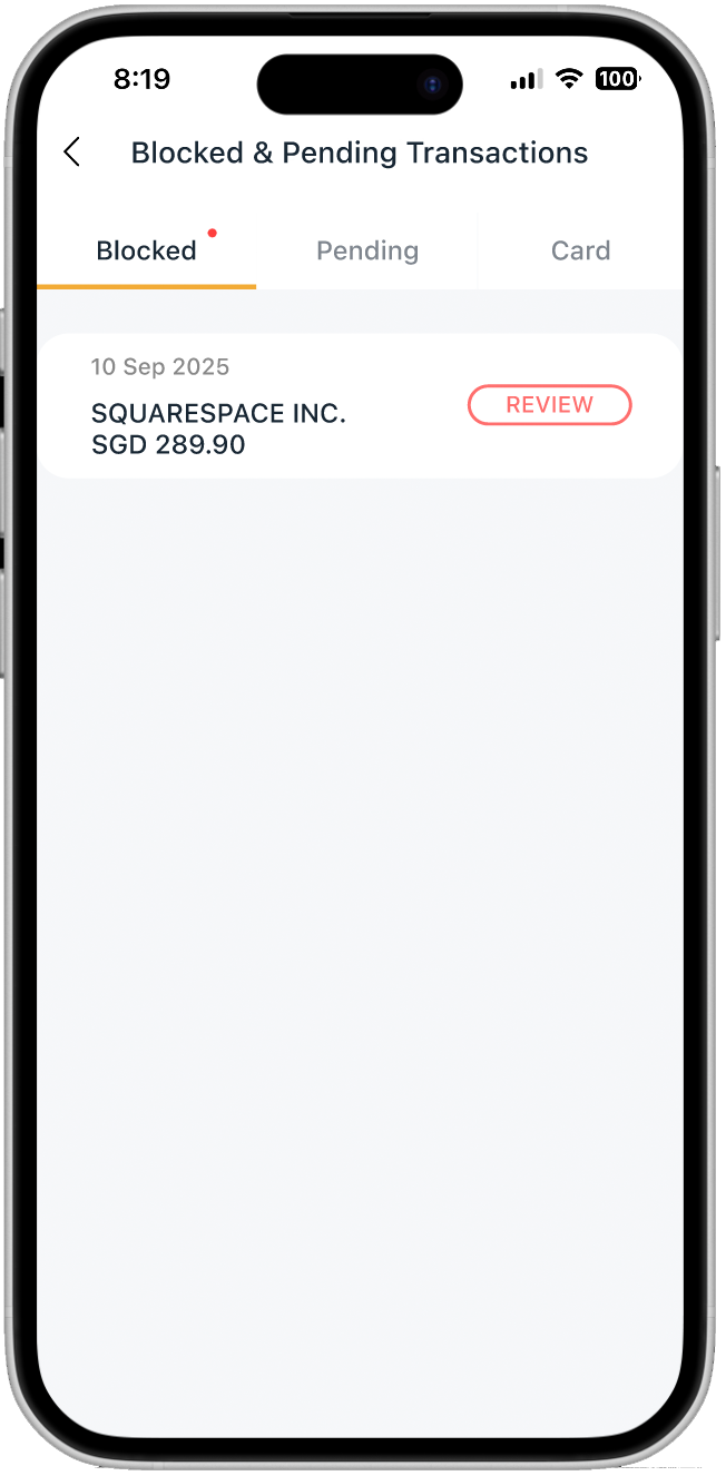
Centralized Resolution: The "Blocked" tab opens by default upon clicking the banner, prioritizing the transaction that requires immediate intervention. This reroutes the user back to the “Happy Path”.
Clean Dashboard State: Once resolved, the "Blocked & Pending" shortcut disappears, freeing up the dashboard for daily banking tasks and signaling a "Job Done" state.
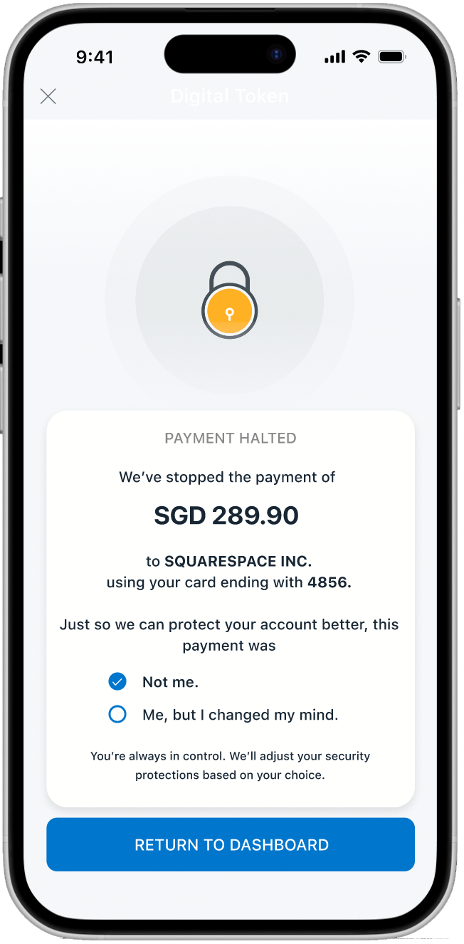
Closing the Loop: If a user taps "Reject," the app halts the payment immediately.
Data-Driven Security: The app collects insight, whether it was a fraud or a mistake. This feedback loop allows the bank to adjust security settings, turning a failed payment into a security improvement.
Alternate path
Scenario B: User Rejects Transaction (Fraud Prevention)
Clean Dashboard State: Once resolved, users are routed to the dashboard for daily banking tasks and signaling a "Job Done" state.
Usability Testing & Iteration
Testing with a diverse age group revealed that Security UX is visual.
Positive Experience: A user rated the verification experience a 4/5 , compared to their previous experience of 0/5 trying to resolve a blocked transaction.
The "Select All" Issue: One user thought checkboxes were either/or. I iterated from circular to square checkboxes to clearly signal a multi-step acknowledgement.
Clarity of Identity: One user wanted to see their own name and masked account details on the scan screen to confirm they were in a legitimate session.
Visual Reassurance: Based on feedback that the success screen was too subtle, I added more "Success Green" and larger iconography to provide immediate emotional relief.
Outcome (Conceptual)
Conceptually, the flow suggested these benefits across users and operations:
fewer hotline calls for verification
faster completion for legitimate transfers
Improved trust perception through transparency
Friction didn’t disappear—it became understandable, which made it acceptable.
Reflections: Finding the Equilibrium
This project reinforced the view that users shouldn't have to choose between security, compliance, and convenience. They must be balanced to be equally important.
What went well
Shifting from phone call verification to an in-app verification eased the biggest pain points—anxiety and time-loss—while creating a grounded, practical solution. By understanding the bank’s perspective (regulations and liability), I was able to frame how far a digital solution could realistically go without becoming a security risk.
The Challenges
Microcopy was difficult; some of my "human" phrasing didn't resonate as strongly with users as I expected. Additionally, working within an existing UI felt limiting at times, but it forced me to focus on the Service UX rather than just "pretty" screens.
Key Learning
Not every design will satisfy everyone. The challenge of modern banking is finding the "sweet spot" where regulatory requirements are met, but the user feels protected, not punished. Safety and convenience do not have to compete. When authentication is grounded in transparency, friction becomes justified. As a designer, my job is to advocate for the user while being a partner to the business by respecting the rules of compliance.