eastwood family clinic app
A fictitious, non-commercial project made for learning purposes.
The Product
Eastwood is a healthcare companion app designed for a family clinic setting. It allows patients and caregivers to register, pre-fill health surveys, book appointments, and track their live queue status—reducing wait-time anxiety and streamlining in-clinic operations. The goal was to create a calm, accessible experience that prioritises clarity and trust in a medical setting.
focus areas
UX flows, service design, microcopy, accessibility, queue transparency, forms design
ROLE
Sole UX Designer (research, wireframing, writing, mockups, prototyping)
PROJECT DURATION
2 weeks


The Problem:
Users can only register for their appointment upon arriving at the clinic, which is often crowded with long lines. Many patients are already unwell, and the slow registration process, repetitive data entry, and lengthy health screening forms increase their frustration. The lack of clarity about where they are in the queue and what to expect next makes the wait unpleasant—and at times, unbearable.
The goal:
To design an intuitive, easy-to-use app and responsive website that enables users to:
Register for appointments remotely
Complete health screening questions in advance
Stay informed about their position in the queue and what to expect next
The goal is to enhance convenience, streamline the experience, and build trust and confidence in the clinic’s brand.
User research summary:
Initially, I assumed that the registration process was neutral and could be improved through personalisation and warmth. I also believed that seniors or users with low digital literacy would need a highly intuitive experience to navigate the app comfortably.
However, research revealed that:
The user’s physical discomfort significantly amplified their frustration during registration. What may seem like a neutral process becomes emotionally taxing when unwell.
Users wanted to feel reassured and informed during their patient journey.
Some elderly users may not be familiar with apps at all. A solution needs to include caregiver support to register on behalf of the patient.
1
Long in-person registration queues
Design Opportunity:
Enable online registration in advance.
PAIN POINTS
2
Repetitive form-filling each visit
Design Opportunity:
Allow profile creation to save user details
3
Elderly users struggle with tech
Design Opportunity:
Add caregiver registration functionality
4
Screening questions are long and hard to read
Design Opportunity:
Use a clear layout, progress bar, and make it screen-friendly
5
Unclear patient journey
Design Opportunity:
Show queue number and live updates to keep users informed
6
Stressful clinic environment
Design Opportunity:
Incorporate calming visual design, personalisation, and a content section to ease the wait
Scenario
Henry feels unwell and leaves his shop to visit the family clinic. He must travel, wait in line, fill out lengthy forms, and endure the frustration of not knowing how long the process will take. He wishes there was a more efficient way to manage this.
Frustrations
In-person registration only
Hard-to-read online forms
Long, uncertain waiting time
Goals
Register and complete forms online
Spend less time at the clinic
Be informed about his position in the queue
Persona
Henry, 59, is a busy watch store owner. He wants to minimise time spent at the clinic so he can return to running his business quickly.
The user flow:
User selects preferred language
Chooses to register for self or others
Fills in personal details or selects saved profile
Completed health screening questions in sequence
Receives queue number and is shown how many patients are ahead
Digital Wireframes And thought process

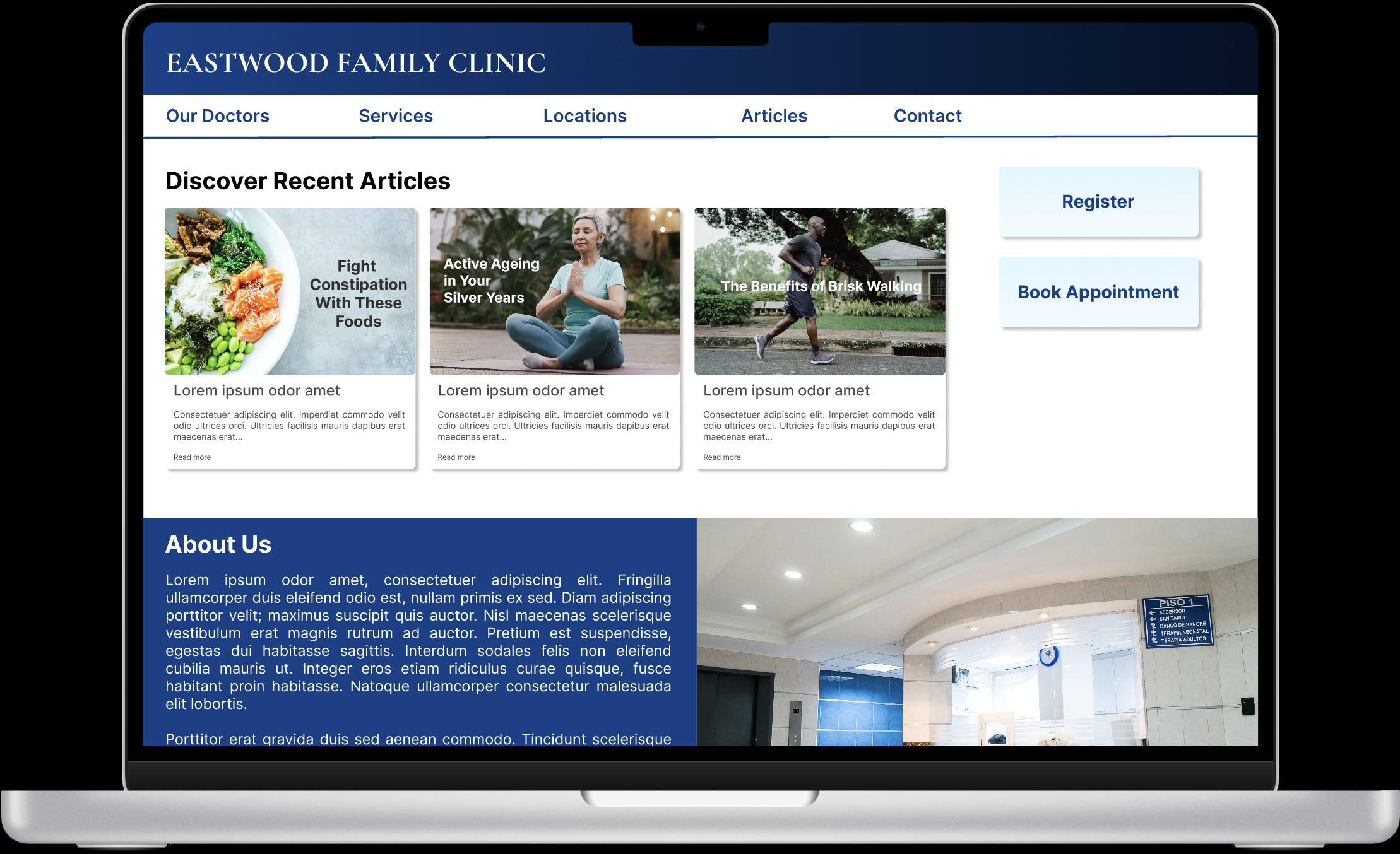
Responsive Desktop Website
The site functions both as an informational platform and a gateway to download the mobile app, using a layered cake layout to highlight important sections.
Key actions (like ‘Register’) are placed prominently using an F-shaped layout and eventually styled with gradients for visual hierarchy.

Mobile Website
Layout is simplified into a single-column structure for clarity
Navigation is tucked into a hamburger menu
Key CTAs (like ‘Register’) are positioned at the top and center for visibility and convenience
Originally labeled ‘Check-in’, the CTA was later renamed to ‘Register’ for clarity
Content now is compressed into a single column, with users having to swipe image carousels horizontally to view more.
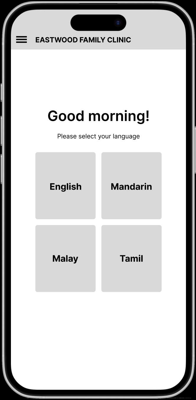
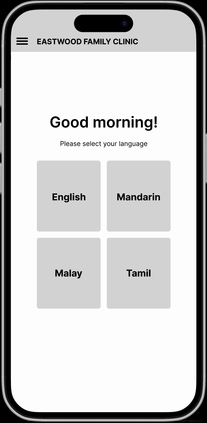
Upon choosing ‘Register’, the first important page that opens for users is to select their preferred language.
Language Accessibility
Language selection screen uses a 2x2 layout to avoid unintended hierarchies
Reflects Singapore’s multilingual context and inclusivity
KEY DESIGN CONSIDERATIONS
Caregiver Functionality
Caregivers can register on behalf of users with low digital literacy (e.g., elderly or children), ensuring broader access to the convenience of online registration.
Profiles allow personal data to be saved for personal use.

Register for yourself or a patient’s behalf.

The site/app remembers past profiles while allowing you to create an additional different profile.

If there is no past memory of a profile, a new profile can be created.

Registration and screening questions are designed as a linear, uninterrupted flow. Users do not need to spend time to navigate out to another part of the page to complete the questions but are instead automatically directed to it once the patient’s details have been captured.


Progress bar added to health screening forms to reduce the sense of never-ending questions.
Users can edit previous answers at any time.
Low-fidelity prototype and usability test
Main task:
Register and complete health screen questions.
Usability study findings
Task flow was straightforward
Design was simple and intuitive
Overall experience was pleasant, but slightly clinical
Participants wanted to know next steps after registration, so a consultation room assignment was added
Refining the design
Focus was placed on mobile versions, which posed greater design constraints. I enhanced:
Color palette for warmth and calmness
Typography for clarity and accessibility
Gradients and depth to soften the clinical feel
BEFORE


AFTER


Home button colour contrast refined, font size adjusted, more gradients for depth and harmony utilized in the headers, backgrounds and buttons.

Desktop BROWSER Mockup


Mobile site homepage - web browser, slight changes upon successful registration

MOBILE BROWSER Mockup

Mobile website homepage - after successful registration
High-Fidelity Prototype — MOBILE APP
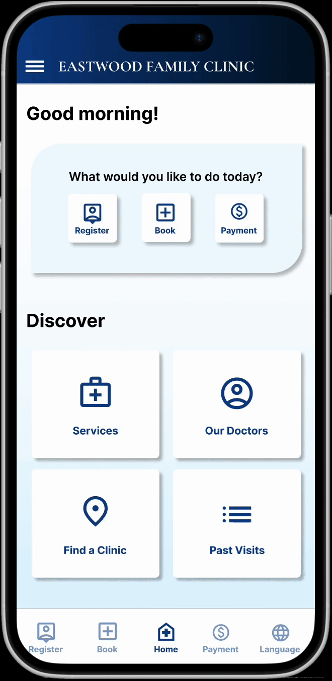
Multiple layout iterations improved polish and usability.
The downloadable mobile app includes a bottom navigation bar with key actions, differing from the mobile website version.
Also increased contrast and clarity in UI elements.

Final SCREENS
Takeaways
As someone who values intuitive design, it was encouraging to hear from a user that the flow felt "simple, straightforward, and hassle-free.”
Next steps
One improvement I plan to explore is adding an online payment flow, inspired by my own frustrations with making digital payments on existing healthcare apps.