Cinehive
A fictitious, non-commercial project made for learning purposes.
Designed to be the app you whip out when you feel the itch to watch a movie, CineHive is a cinema app that blends entertainment discovery with seamless ticket purchasing. Users can browse trailers, explore now-showing films, and purchase tickets—all within a visually engaging, mobile-first interface. The project focused on creating an immersive, easy-to-navigate experience that puts the excitement of cinema first.
FOCUS AREAS
UI hierarchy, visual engagement, seamless booking UX
Role
Sole UX Designer (research, wireframing, writing, mockups, prototyping)
Project Duration
5 days
The Product

The Problem
Most existing movie ticketing apps and websites do not show trailers. Users often have to leave the app to search for trailers on YouTube, decide if they’re interested, and then return to book their tickets. This disrupts the flow and can result in losing good seats—especially for popular showtimes. The extra steps can also create decision fatigue or cause users to drop off entirely.
The Goal
To create a ticketing app that integrates movie trailers directly into the experience, so users can browse, preview, and book all in one place. The app should also provide a well-designed seat selection interface and offer a fast, hassle-free checkout.
Pain Points and Opportunities
Design Opportunity: Make trailers a core feature on the homepage
Apps do not include trailers.
Design Opportunity: Auto-play trailers directly within movie listings.
Users have to leave the app to view trailers, which disrupts the flow.
Design Opportunity: Provide multiple entry points to booking (e.g. Theatre tab on homepage)
Booking via preferred theatre is inconvenient.
Design Opportunity: Create a smooth, intuitive seat selection (e.g. Best Seats auto-select) and quick checkout
Friction in booking flow can lead to drop-offs.
Design Opportunity: Offer in-app e-tickets that are instantly accessible.
Users lose or forget email confirmations.
The Ideal User Flow
Users open the app
Browse trailers on the homepage
Select showtime and date
Choose seats
Complete payment
Receive confirmation and access e-ticket in-app
Wireframes and Thought Process
While the core goal was to integrate trailers directly into the app, I also identified another frequent user frustration:

With this in mind, I designed Movie, Theatre, and Date selection options to be front and center.
Originally, they were positioned as floating buttons fixed on-screen, while the nav bar handled secondary functions. However, the layout felt cluttered, so I moved them into the bottom navigation bar to streamline the experience. The main navigation now prioritises the user's primary goal—booking tickets quickly with minimal clicks.
Initial floating button design—
“Buying via the ‘Now Showing’ tab is fine, but trying to book tickets through my preferred theatre takes too many clicks and gets inconvenient.”
Initial Paper Wireframes

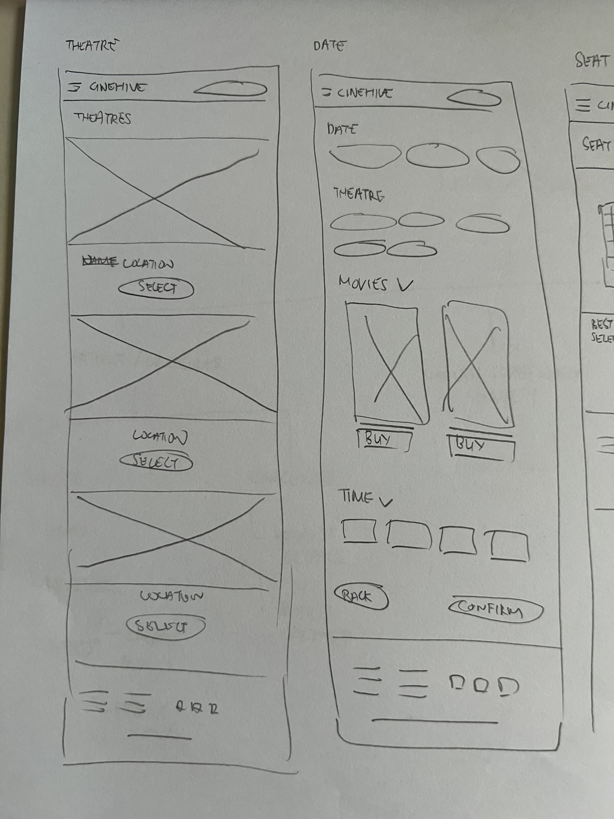


Digital Wireframes

Main task
Purchase a ticket successfully.
Task completion
100%
Usability Test
Users shared that they wanted a Back button on the seat selection page, especially if the available seats weren’t to their liking and they wanted to pick a different showtime. In response, I added Back buttons across the main booking flow:
Movie Listing Page
Seat Selection Page
Payment Page
Refining The Design

High-Fidelity Prototype and thought process
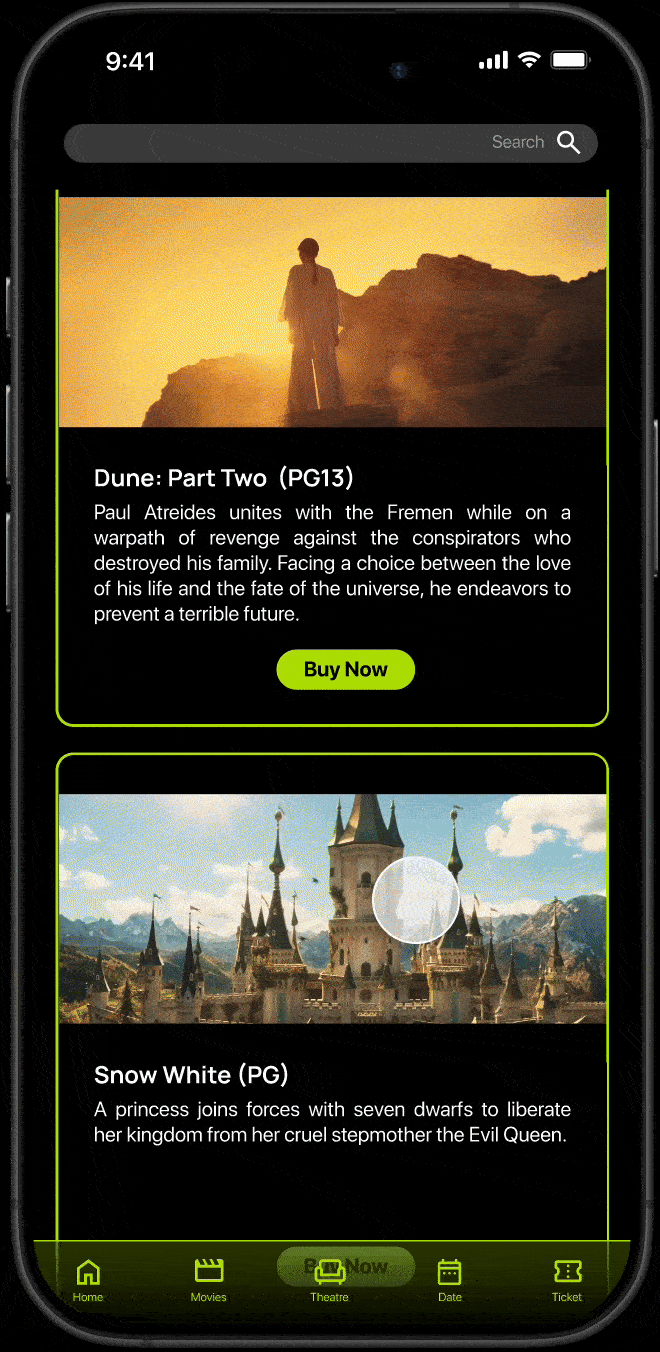
Image carousel for ongoing promotions placed at the top of the homepage to drive visibility and sales.
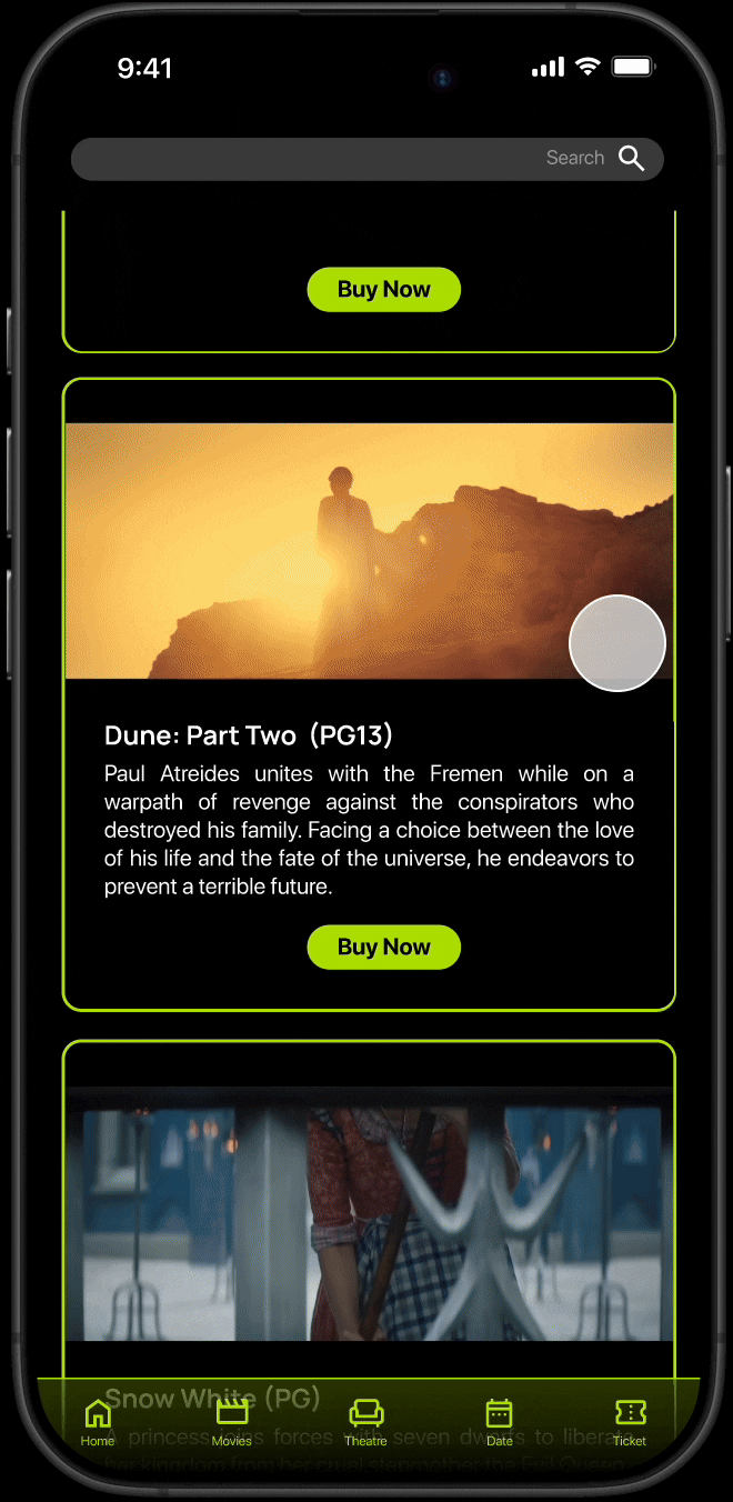
Just below (still above the fold), auto-playing trailers of movies currently screening. Inspired by the TikTok search experience, users can passively browse and get drawn into a trailer without effort.

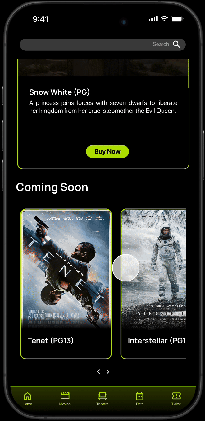
Posters of upcoming movies are shown at the bottom of the page to tease future releases.
While watching a trailer, users can click a ‘Buy Now’ button that leads to the movie listing page, keeping engagement high and the experience seamless.

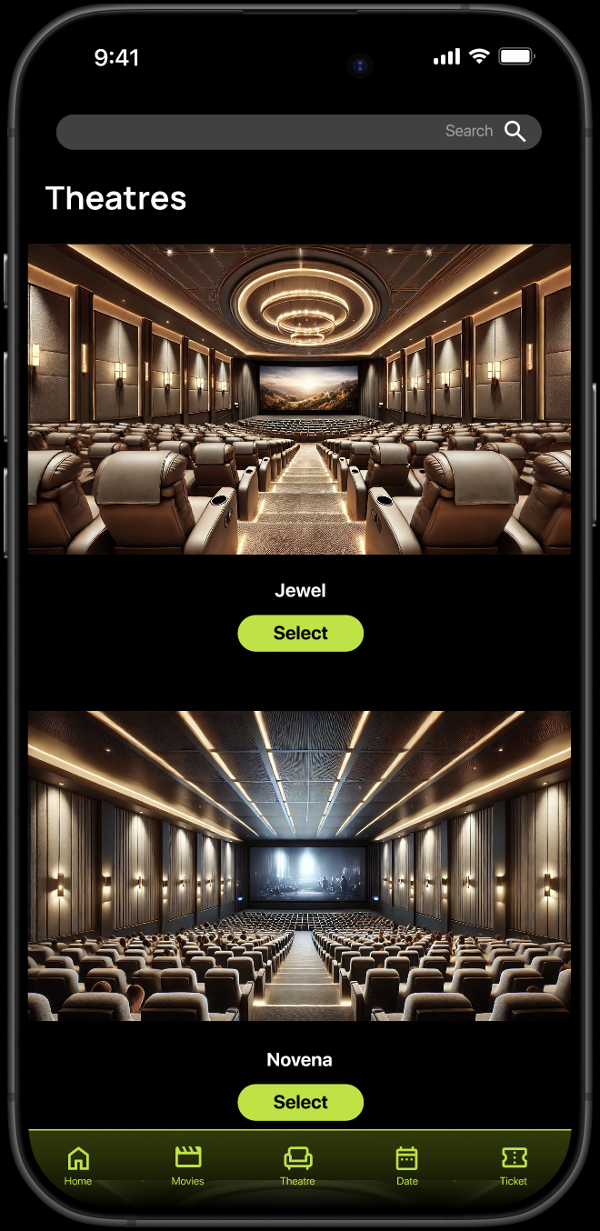
The bottom navigation bar gives users multiple ways to begin their booking journey—by Movie, Theatre, or Date, depending on what they prioritise.
This reduces unnecessary steps and improves efficiency for different user types.
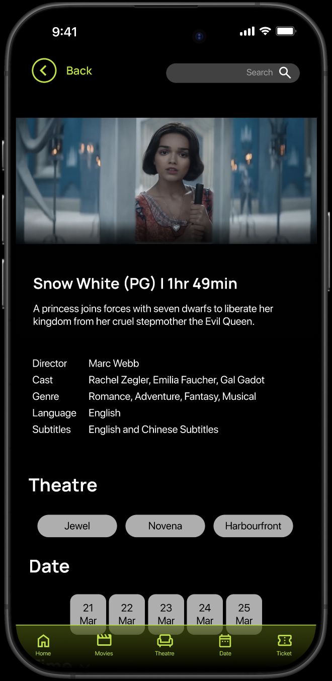
Move listing page includes an auto-playing trailer, which pauses once scrolled past.
Below that: movie synopsis, key info, preferred theatre, date, and showtime options.
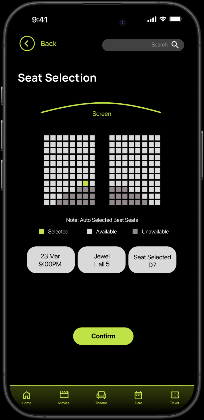
Seat selection page includes a ‘Best Seats’ auto-selection feature to reduce decision time.
Users can still manually select their own seats if preferred.
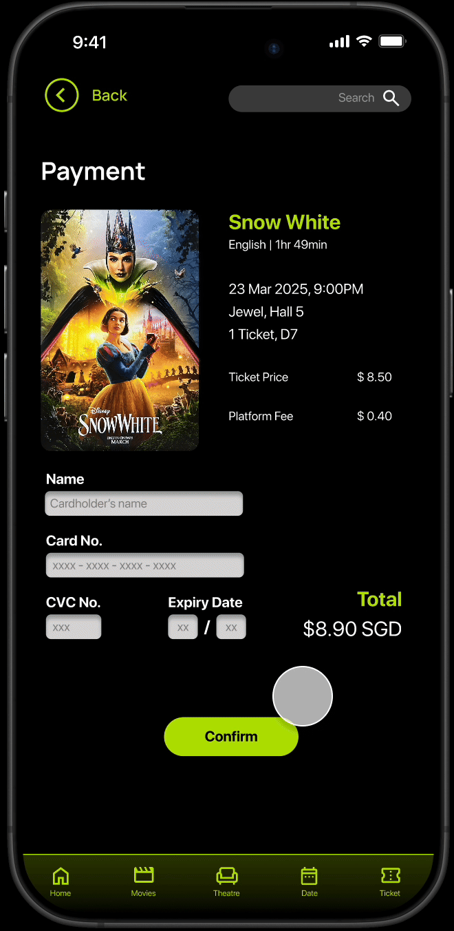
Payment page displays a summary of booking details and a payment form.
Ticket pricing and platform fees are clearly broken down, with the total shown prominently.
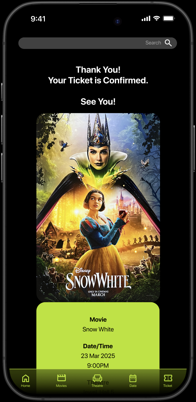
After payment, users are brought to a confirmation page displaying their e-ticket as a QR code.
This e-ticket can be easily accessed anytime from the ‘Tickets’ tab in the bottom navigation.
The e-ticket is styled to resemble a physical movie ticket—a fun, thematic detail.
A CTA button at the bottom encourages users to return to the homepage to explore more trailers, increasing session time.

Final SCREENS
Moving Forward
Future improvements could include:
Real-time seat availability indicators (e.g. “Selling fast”)
User reviews and trailer ratings to build community trust and deepen engagement
These features could help position CineHive as the go-to app for both casual movie-goers and film enthusiasts, combining functionality with a rich, media-forward experience.