PEBL
A fictitious, non-commercial UI-focused project created for learning purposes.
The Product
Pebl reimagines social media as a quiet, minimalist, calming space for authentic moments—cutting out ads and content pressure. It prioritises intuitive interactions and visual aesthetics. With its ripple-inspired interface and soft visual system, Pebl encourages users to share everyday moments without the noise. This project highlights minimalist UI design and emotional UX.
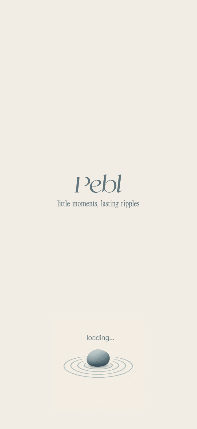
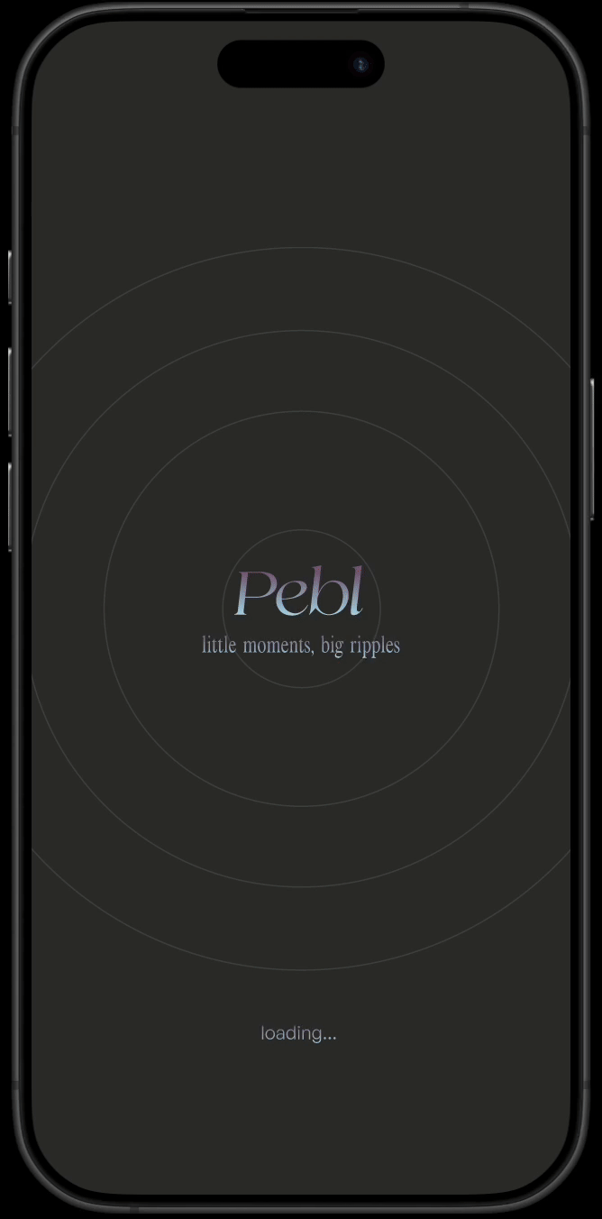
“Pebl – Little moments, big ripples.”
Focus Areas
Visual identity, UI consistency, emotional design, microcopy
Role
Sole UX/UI Designer (visual design, wireframing, UX writing, mockups, prototyping)
Project Duration
3 days

The Goal
To design a visually calming, minimal, and intuitive social app that fosters connection through authentic, everyday moments.
“I love using it and sharing my day with my circle of friends.”
The Problem
How might I design a modern social media app that strips away the bloat and encourages users to focus on genuine content and the joy of sharing?
Pain Points and Opportunities
Design Opportunity: Create a clean, ad-free interface with a focus on content. Introduce an elegant, simplified feed and a calming visual design.
Design Opportunity: Design the app to reduce the pressure to “perform”. Encourage casual posting through low stakes UI and copy. Normalise small, mundane moments as meaningful.
Modern day social media apps are bloated with ads, promotions and cluttered UI.
People only post highlights, not daily moments. Modern day social media apps seem more about branding oneself than connection.
User Needs Identified
Simplicity of interaction
Visually pleasing layout
Emotional safety in sharing
The Ideal User Flow
The user opens up the app
Browses through posts from friends
Engages with a post
Taps the “Upload” button to share a new post
visual design and thought process
Design Inspiration
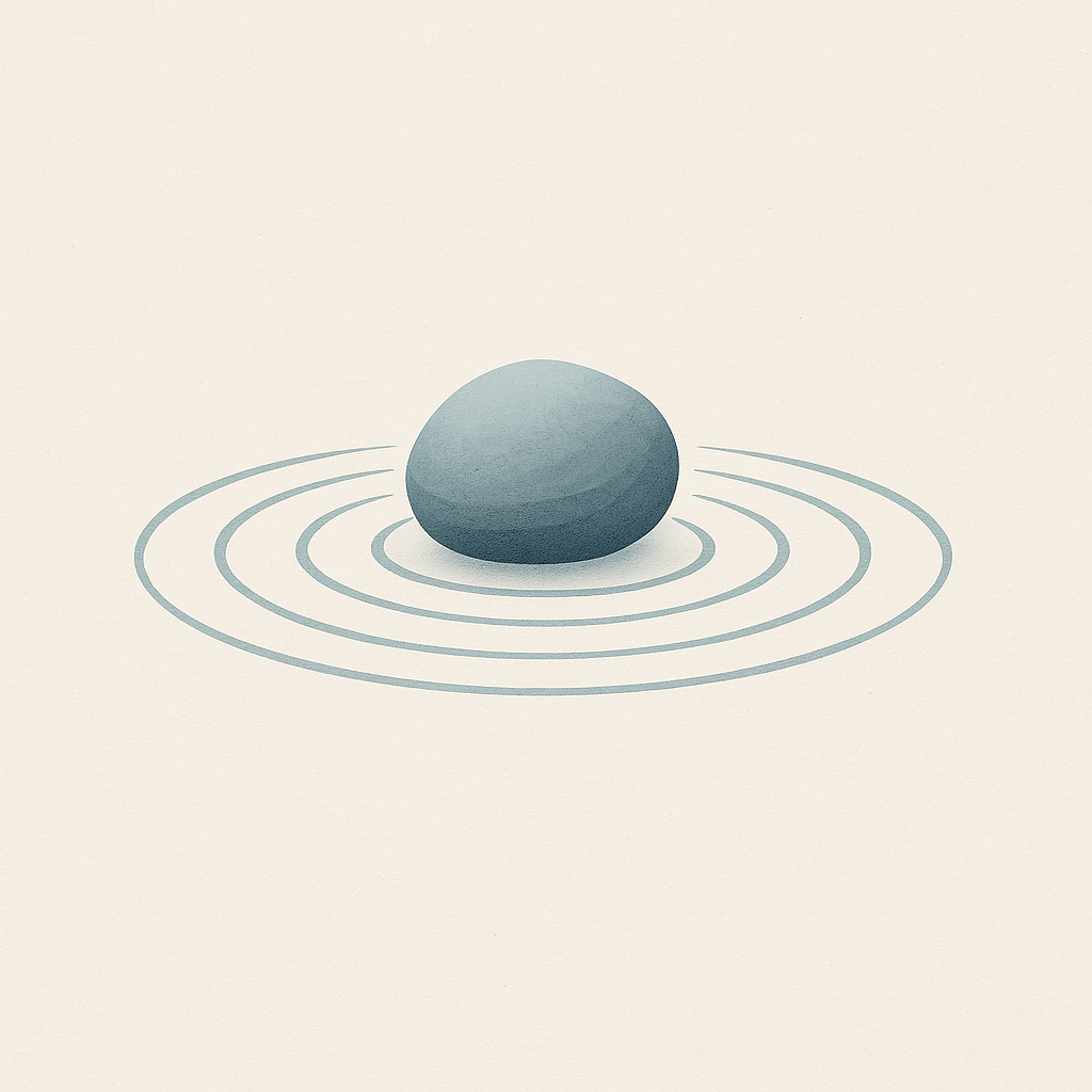
Minimalism, simplicity and reflection > Japanese rock garden/zen garden > rock and line patterns > ripples in calm waters
Emotional & Brand Layer
Pebl is designed to evoke feelings of calm, delight, and quiet anticipation—like discovering a visual treat. The app aims to be a comforting space that encourages casual sharing and meaningful connection.
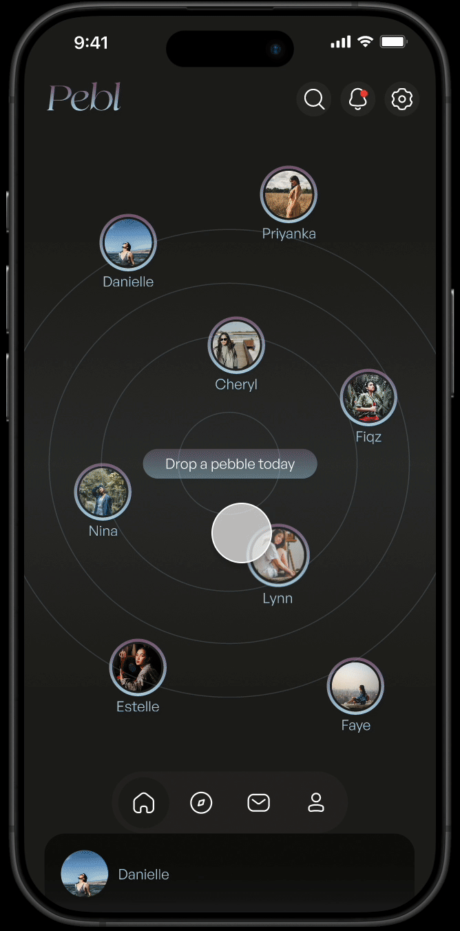
Redesigning the Home Feed
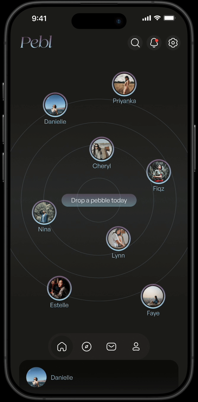
Pebl’s Home page uses a distinctive layout inspired by ripples in water to guide user interaction.
Ripple rings: Unviewed new posts appear within subtle ripple lines at the top of the page, above the fold. These float organically around a central CTA:
“Drop a pebble today.”
The tone of voice, such as the CTA “Drop a pebble today”, is inviting and low-pressure, aligning with the app’s gentle, reflective nature.
The interaction design further supports this emotional tone: unviewed posts ‘float’ along ripple lines, drawing users in with a sense of movement and presence. The home feed feels dynamic and alive—not just a static page.
Once viewed, older posts shift down into a traditional scrolling feed below the ripple area (this animation unfortunately does not appear in the prototype).
This design excites and keeps users visually focused on new, unseen content, while still allowing them to scroll back and enjoy older moments. It blends visual novelty with usability — giving users a gentle push to check in, without the pressure of algorithmic urgency.
Gently fading in to the home feed.


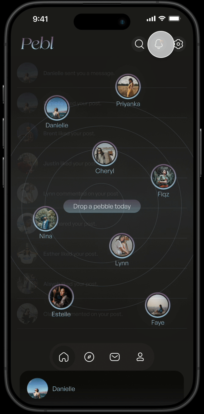
Open unviewed new posts above the fold.
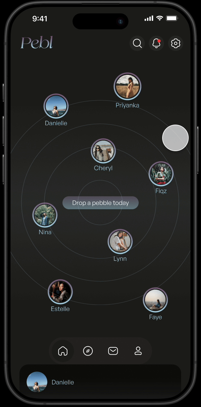
Profile icons blooms softly upon hover.
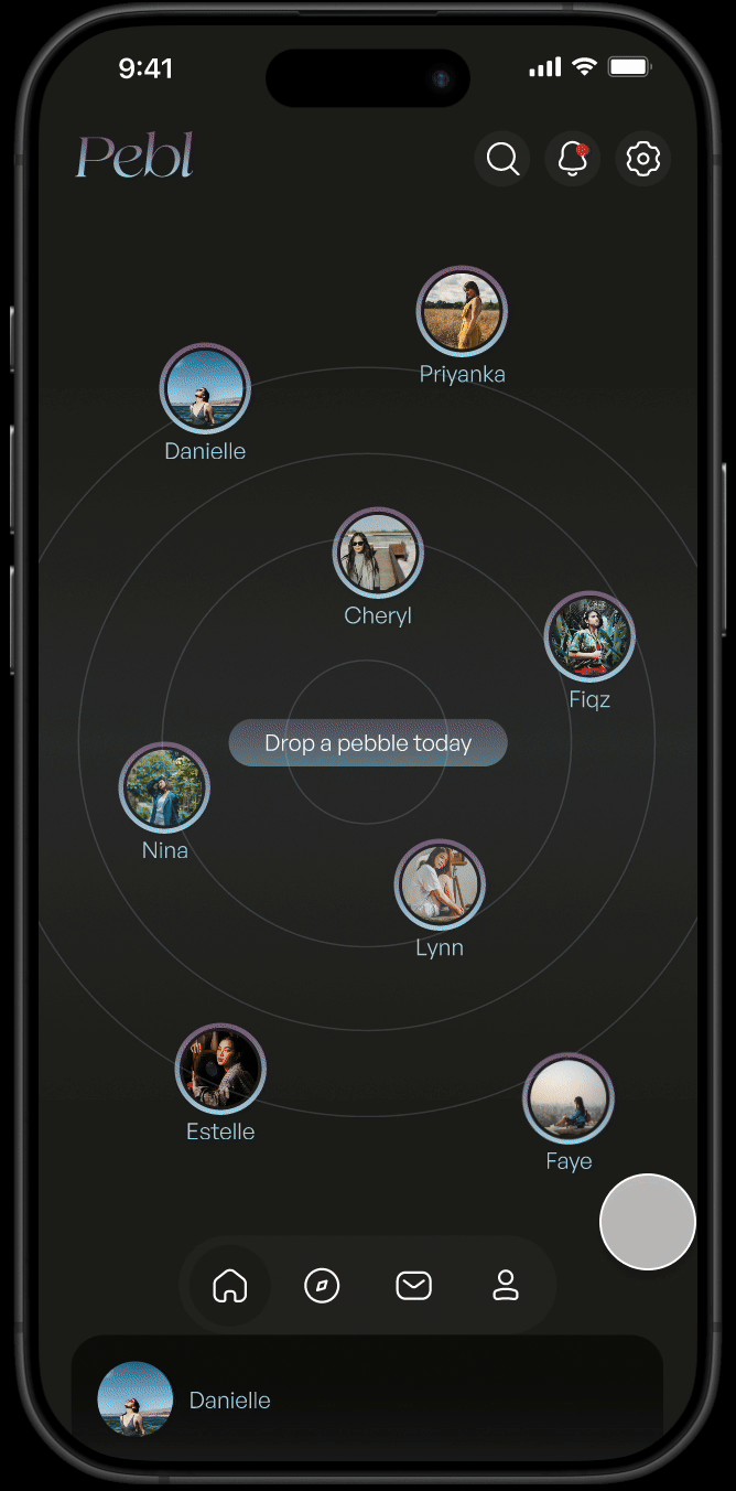
Older posts are in a feed below the fold in the familiar single-post style.
Color & Typography
Muted colours, cool tones and clean sans-serif rounded typography were used to evoke calmness.
Visual System
Icons are rounded with minimal sharp edges, echoing the visual metaphor of smooth pebbles and gentle ripples. This soft design language reinforces the calm, approachable feel of the interface.
UI Consistency
Visual and interaction patterns remain consistent across key sections like Explore and Profile, ensuring a smooth and unified experience as users navigate the app.
Information architecture
Button Navigation: Home, Explore, Inbox, Profile
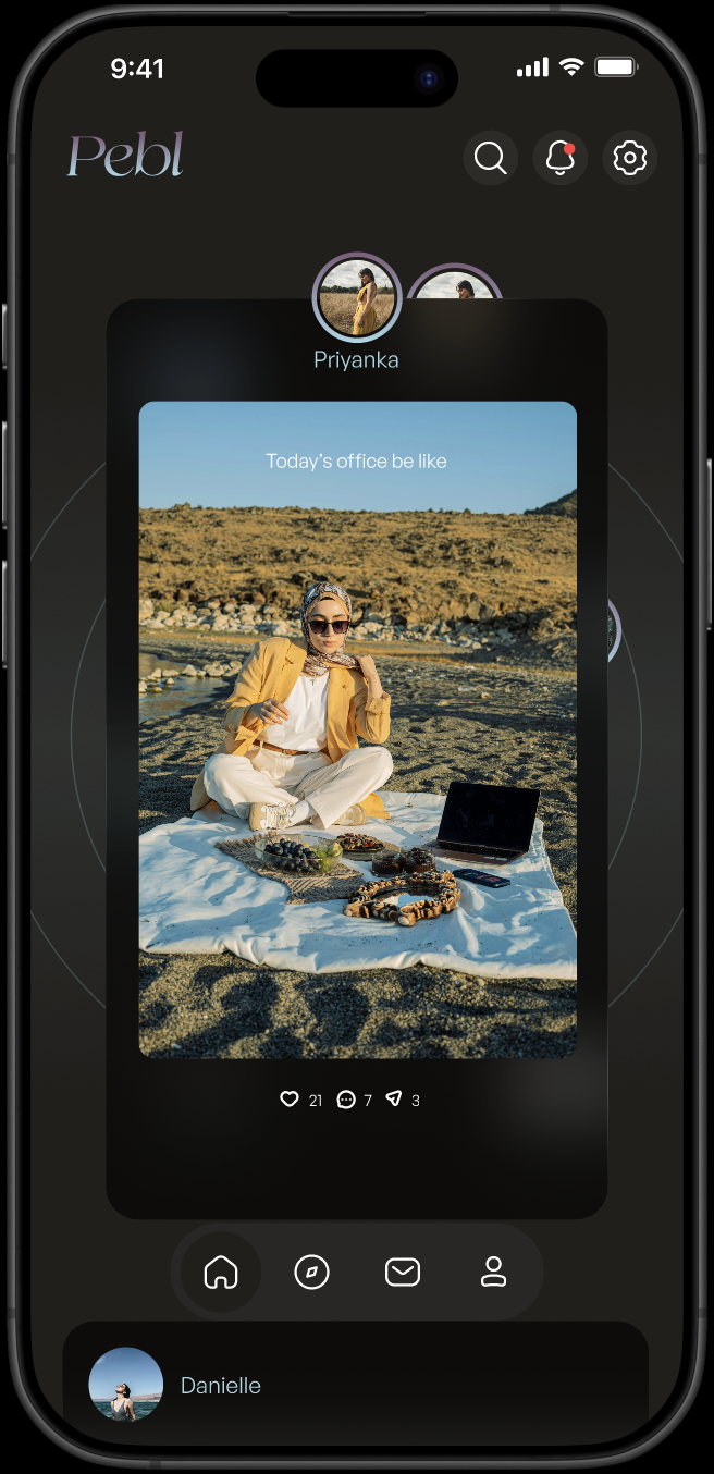
Home
Feed with ripple-layout posts; central post CTA.
Tapping a profile picture opens a central floating insert with the post, keeping the user grounded in the visual space.
Users can like, comment, or share directly from the card
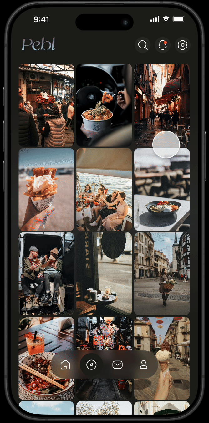
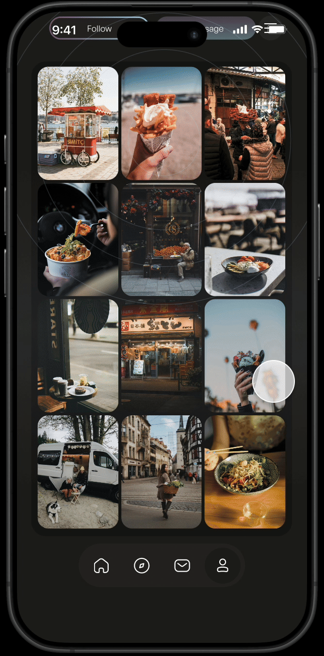
Explore
Scrollable gallery grid; tap to expand any post in a floating insert
INbox
Clean list of chat rooms; bolded message as an indicator of unread messages
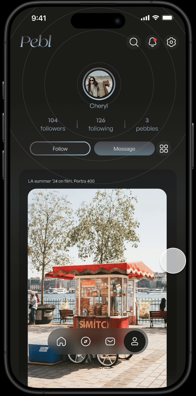
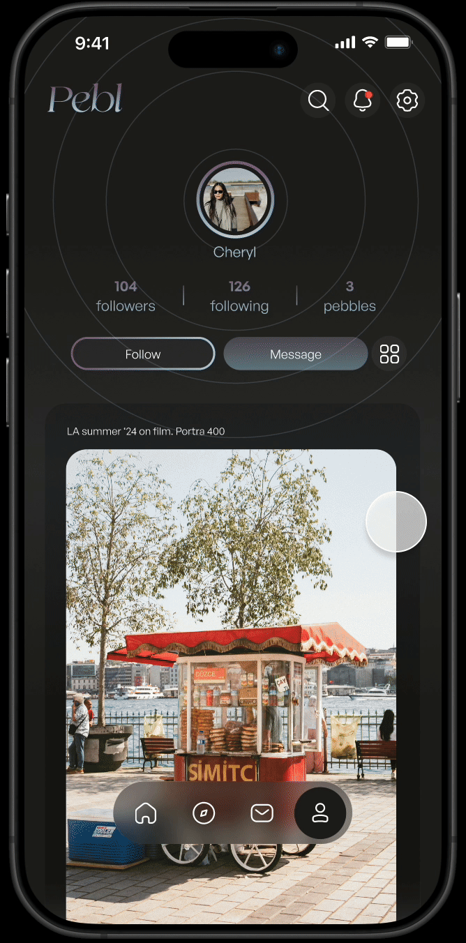
Profile
Ripple-style layout featuring a circular profile photo at the center, with follower, following, and post stats displayed below.
Users can toggle between a scrollable single-post feed or a grid view for browsing past posts.
Notification
Top right-hand corner icon. New notifications marked by persistent red alert dot.
Post Creation Flow
Creating a post is designed to be as fictionless as possible:
Choose an image/video or take a photo
Add optional music
Add a caption
Tap to post
Usability Test
Main task
Create and post a new entry
Task completion
100%
Insight
Users found the interface intuitive and especially appreciated the “Drop a pebble" CTA as a playful invitation to share.

Final Screens
Reflections
This project focused on strong UI craft over UX problem-solving. It helped me refine:
- visual consistency across pages
- designing for calm, minimal emotional UX
- microcopy tone for lower-pressure interactions
Moving Forward
It would be good to create a light mode of the app’s UI for better accessibility (i.e better colour contrast)