Improving Onboarding for a Mental Health App
This conceptual UX case study explores a real problem observed in mental health and well-being apps and involves a common UX challenge: improving Day 1 user activation. The goal is to showcase my UX design thinking, rather than UI prototyping.
I was presented with a realistic scenario involving onboarding drop-off – a common issue in apps that require emotional engagement and consistent usage. The goal was to reduce onboarding drop-off and help users engage meaningfully with mood tracking, breathing exercises, CBT reflection tools, and journaling features from the first session.
Here’s how I’d approach solving it, with a focus on user-first design, sensitivity and storytelling.

The Problem and Challenge
In an early private beta, analytics show that a mental health and well-being app is seeing good retention after Day 3, but high drop-off on Day 1. Data shows users who complete onboarding and log one entry are 60% more likely to stay active for at least a week.
The existing onboarding consists of:
Welcome screen
App features overview
User goal selection
Optional profile setup
Mood check-in
Objective: Increase Day 1 activation by improving the onboarding experience, while preserving emotional sensitivity for users.
My UX Approach
Based on the data and context, I formed two key hypotheses:
The current onboarding feels too long or tedious, leading to early disengagement before users can experience any value.
Users aren’t emotionally “hooked” early enough, and the onboarding may lack a sense of personal relevance or reward upfront.
The profile setup may be perceived as unnecessary friction early in the journey.
To validate these hypotheses, I would conduct tests to pinpoint drop-off screens and gather qualitative feedback from beta testers.
User Needs and Emotional Design
Mental health tools require a gentler UX lens as users are often coming in with emotional vulnerability or skepticism, or both.
Some considerations:
Too many screens or information/decisions upfront creates friction.
Lack of emotional resonance early does not build a sense of connection.
Asking for personal data too soon before trust is earned can deter users.
Design Solution
My proposed redesign rearranges the onboarding steps to immediately immerse the user in the app’s emotional core value.
Old flow:
Welcome screen
App features overview
User goal selection
Optional profile setup
Mood check-in
Redesigned flow:
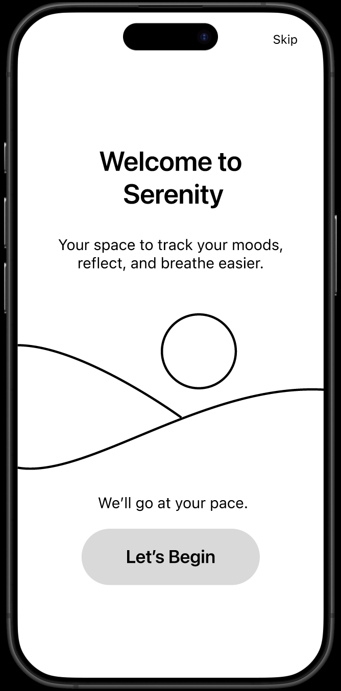
Warm welcome
Mood check-in
Goal-setting
Light feature intro
Profile setup deferred (converted to banner/icon)
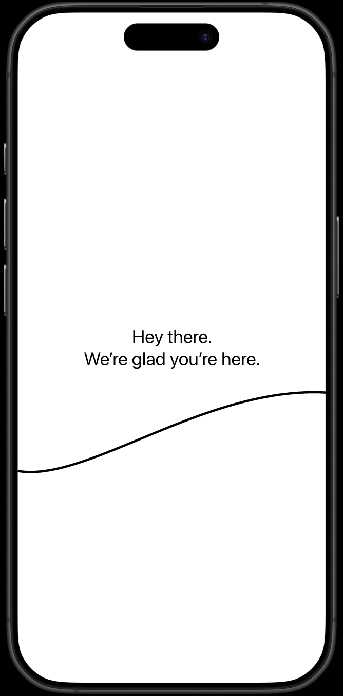
1. Welcome screen
Begin the journey by utilising warm, personalised language to set tone, build trust, and ground users emotionally.
Possible microcopy: “Hey there. We’re glad you’re here”, “Hey there. You’re not alone”.

2. Mood Check-in
Seamlessly transits into letting users interact right away – experiential preview (an appetiser or hook of sorts) to reduce time-to-value. It should be a low barrier interaction that encourages reflection while providing immediate value.
Possible microcopy: “Before we dive in, let’s do a little check-in: How are you feeling today?” (Buttons with emoticons: Good, Alright, Not Great)

3. Goal selection
Tailors experience while building a user’s agency. Onboarding could be framed as a conversation for warmth and better emotional resonance.
Possible microcopy: “What do you want support with?” “How can we help you?”
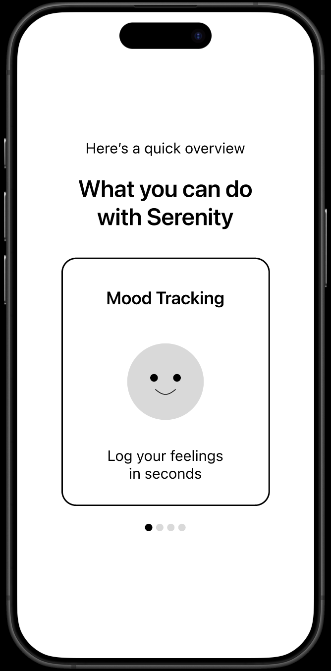
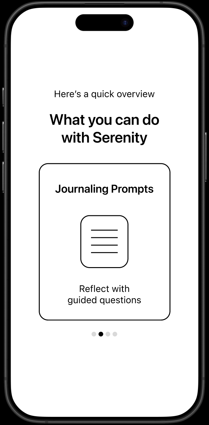
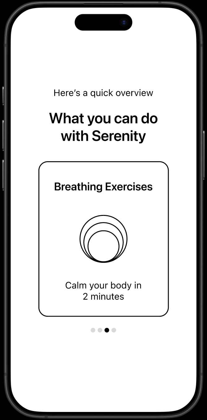
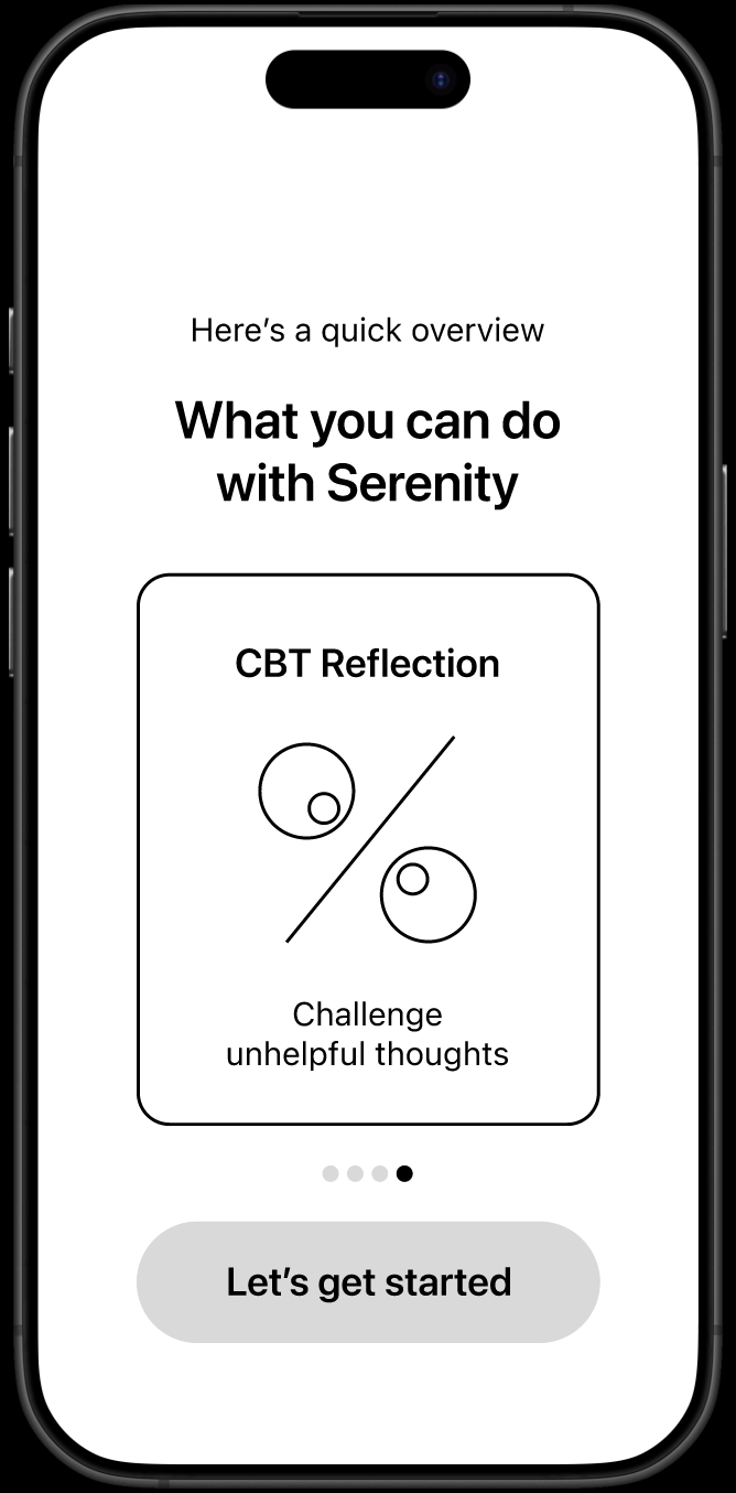
4. App feature highlights
A quick guided tour based on selected goals, not more than 3-4 screens. This serves to introduce and give the product context without overwhelming.

5. Remove profile setup out of onboarding
Prompt to set up the profile is converted into a gentle banner notification or a persistent UI element on the profile icon to reduce friction and maintain optionality.
This reordering gives users a small win early, making them feel seen and understood before asking them for anything.
User Research Plan
A/B testing of the original vs new flow using:
Day 1 activation rate
Entry completion rate
Drop-off rate
Unmoderated usability tests (5-10 participants) to assess flow comprehension and drop-off points.
Moderated usability test (5-10 participants) to hear tone perception, emotional response and moments of friction.
Post-onboarding follow-up surveys for qualitative feedback on which parts were easy to comprehend and which posed friction.
Ethical and Emotional Sensitivity
Because of the mental health context, interactions should be framed gently and not be manipulative.
I would:
Assure users of confidentiality and data privacy (Plain-language for clarity, e.g. “Everything you share is private and stored securely.”)
Utilise gentle opt-ins rather than forced steps
Use soft, empathetic tone and affirming language (Respectful and validating)
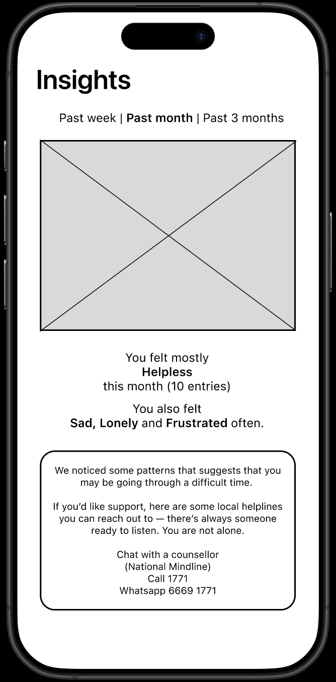
Refer users to clinical help if patterns seem worrying (Offer professional resources, not in-app advice)
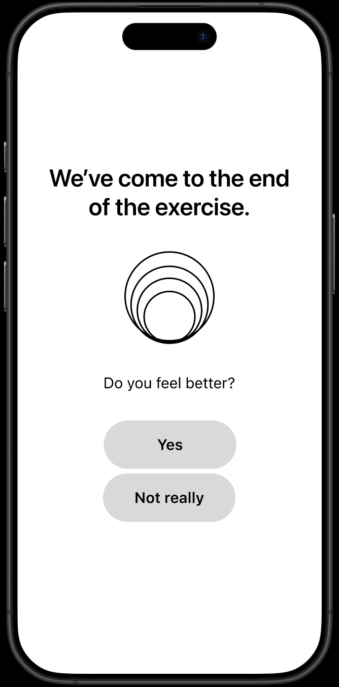
Design post-exercise check-ins to build care while gathering insight (e.g. “Do you feel better?” “Was this helpful?”)
Summary
Provide value early
Reduce cognitive load
Use copy tone to soothe not sell
Design for emotion, not just completion
Make activation feel personal, not procedural
Conclusion and Final Thoughts
This case study showcases my UX problem-solving approach, balancing emotional care with product goals. While not fully prototyped, it demonstrates how I identify root problems, design with empathy, and prioritise both usability and well-being in sensitive contexts.
In a product that supports emotional well-being, the first moments matter most. There is power in sequencing emotional moments early in onboarding for retention. It should also be about building trust with users who may be struggling.