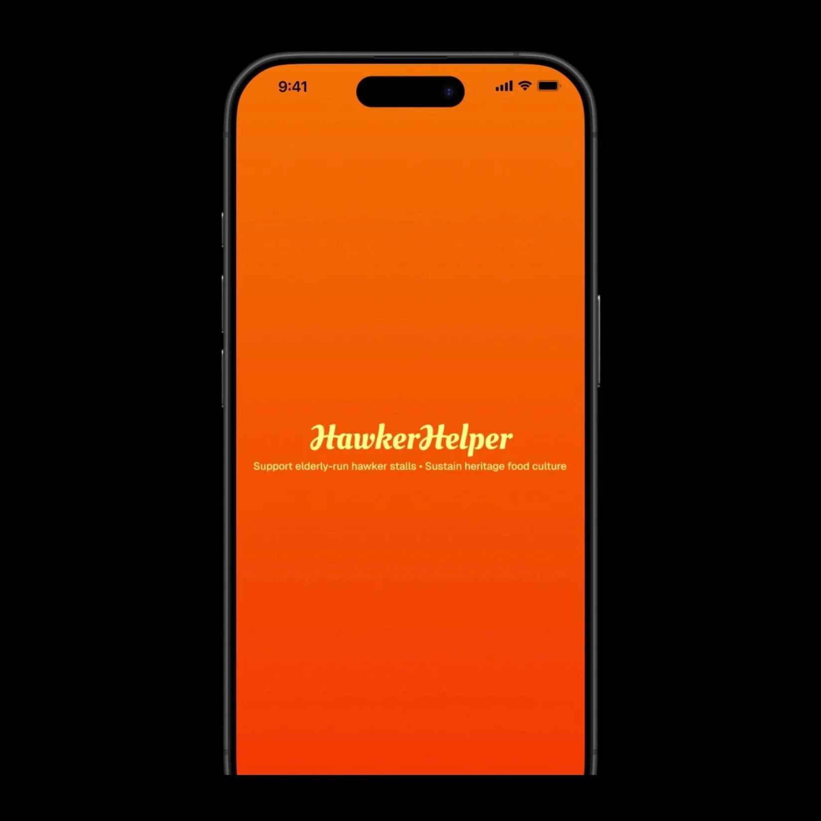
HAWKERHELPER
A fictitious, non-commercial project made for learning purposes.
The product
HawkerHelper is a social good app designed to support Singapore’s elderly-run hawker stalls by encouraging users to discover, photograph, and review their meals. With no ratings and a focus on positive storytelling, the app helps to preserve Singapore’s rich heritage food culture while fostering authentic community support.
Focus Areas
UX for social impact, visual storytelling, review flows
Role
Sole UX Designer (research, wireframing, writing, mockups, prototyping)
Project Duration
4 days
discover
Quick research on existing food apps show that there are no dedicated hawker food/stall apps at the moment.
The Problem
How might I design an app that encourages people to explore the hawker scene and leave positive reviews for deserving elderly-run hawker stalls – without risking harm through poor ratings?
The Goal
To create a gamified and user-friendly review platform that promotes elderly hawkers through authenticity, positivity, and visual appeal.
“I want good community vibes and great food.”
Design Opportunity: Design a clean, refreshing interface. Gamify the experience and add a light social element that rewards users. Make it visually engaging—large, enticing food photos over text-heavy pages.
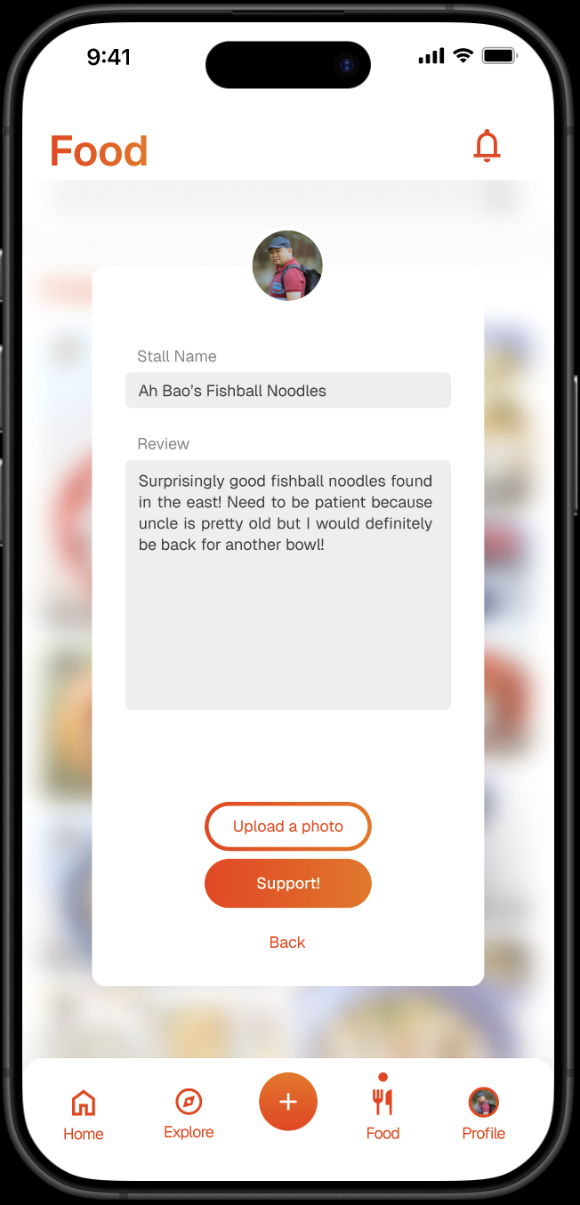
Design Opportunity: Encourage users to post to create a positive experience. Do without star ratings entirely to avoid deterring potential visitors.
Design Opportunity: Reduce navigation friction and increase methods for discovery. Allow users to search by dish or use an Explore tab or map view to discover nearby elderly-run stalls. Review posts should link directly to stall pages so users can browse more dishes and feedback specific to that stall.
Design Opportunity: Make review-writing the core interaction—quick and simple like posting on social media. Place the ‘Write’ button front and center in the navigation bar to encourage frequent contributions.
Pain Points and Opportunities
Hawker food apps don’t feel inspiring or exciting to use.
Negative reviews might harm hawkers more than help them.
Finding specific dishes or stalls isn’t always convenient.
Writing reviews feels tedious or time-consuming.
The Ideal User Flow
User opens up the app and browses dishes or nearby stalls.
User visits a stall and snaps a food photo.
After eating, the user reopens the app and writes a review.
Define
Identified key user needs:
ease, purpose, and visual appeal.
Information Architecture
Navigation bar tabs:
Home. Explore, Write, Food, Profile
key design considerations
An app that excites and encourages
Vibrant bright colours carefully chosen.

Gamified, no-pressure review app
No star ratings, just a space for positive experiences.
Simple, clean UI.

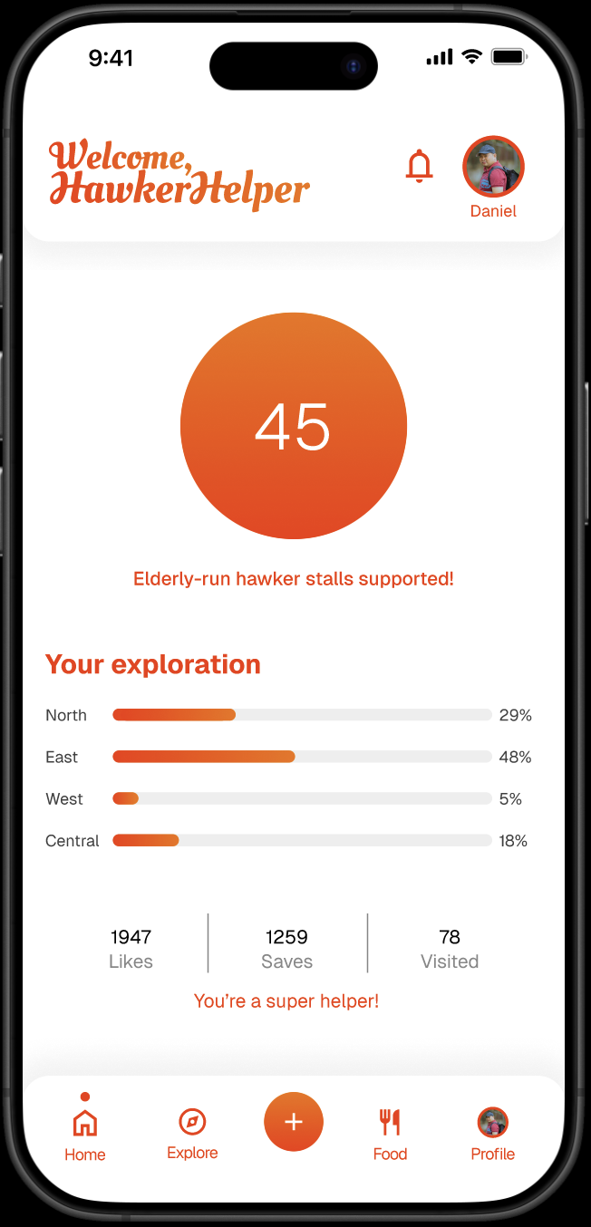
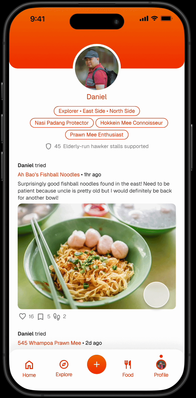
Likes, saves, and number of user visits at the bottom of posts for positive engagement.

Encourage individuality —witty social tags on profile page to reflect what type of food lover users are.
E.g.
Explorer • East Side • North Side
Nasi Padang Protector
Hokkien Mee Connoisseur
Prawn Mee Enthusiast
Community SUpport Angle
Encourages users to “give back” through food discovery.
Homepage display how users’ visits and reviews help support hawkers, reinforcing their impact. Includes: data of their exploration, total count of their interactions on the platform. Every interaction counts.
“You’re a super helper!”

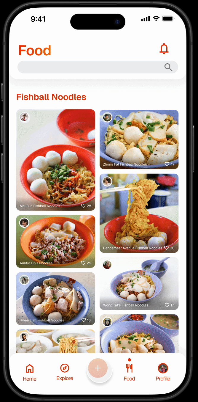
Visual-first experience
Dominated by large food photos with minimal text.
Explore tab’s NearBy Map view includes a pull-up gallery for browsing visually
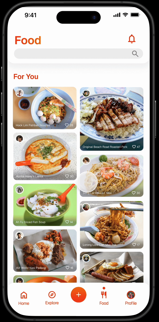
Food tab’s Search function offers suggestions for both popular and undiscovered dishes.
Fast, Friction-less Contribution
Posting a review feels just like uploading to social media.
Write button placement is front and centre in the bottom navigation for quick access.
Usability Test
Main Task
Write a review for a hawker stall
Task Completion
100%
Refining The Design
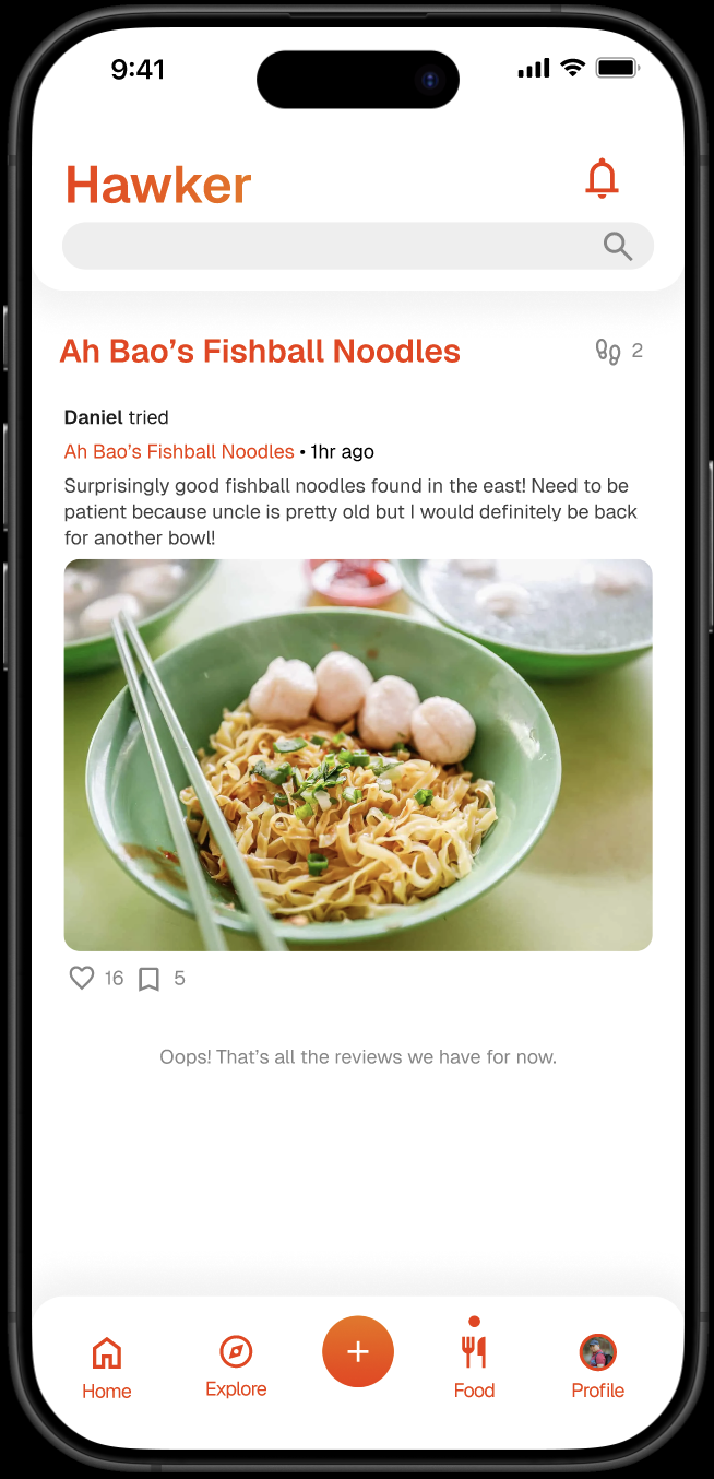
Besides browsing via dish and area, study participants expressed interest in viewing all reviews from a single stall to decide whether it’s worth visiting.
Iteration: While a dedicated ‘Hawker’ tab listing every elderly-run stall in the country would be very overwhelming, a more elegant solution was implemented: stall names in reviews now link to a dedicated page displaying all reviews for that stall. This functions like a tag and allows users to browse other reviews and dishes offered by that stall, prioritising visual discovery.

Final Screens
Reflections
Designing for social good is fulfilling, but requires sensitive UX choices. Small UX tweaks (like tagging stall names) can make huge usability gains.